
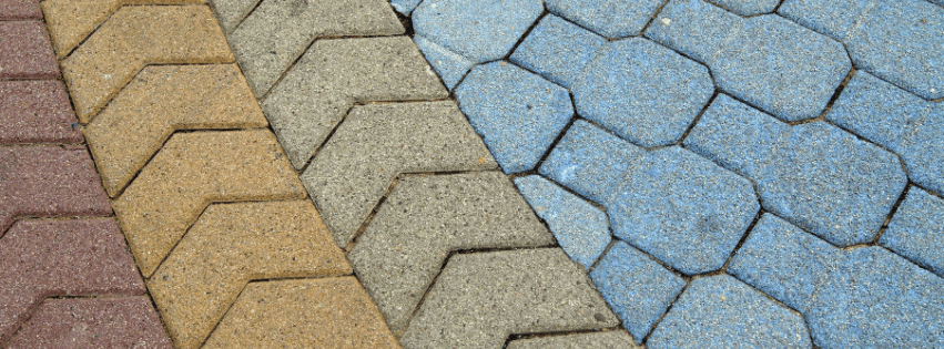
When homeowners begin planning a decorative concrete project, they often focus on patterns, textures, and layout. While those elements are certainly important, color is what ultimately sets the tone for the entire space.
The right color palette can make an outdoor living area feel warm and inviting, create a sleek modern aesthetic, or complement the architecture of your home. Whether you’re planning a stamped patio, stained concrete floor, walkway, or pool deck, selecting the right color is one of the most important design decisions you’ll make.
Here are some key considerations to help guide your decision.
Understanding Warm vs. Cool Tones
Color palettes generally fall into two categories: warm and cool.
Warm Tones
Warm concrete colors often include:
- Beige
- Tan
- Sandstone
- Brown
- Terracotta
- Warm gray
These colors create a welcoming, comfortable feel and pair beautifully with traditional homes, natural stone, wood accents, and outdoor landscaping.
Cool Tones
Cool concrete colors typically include:
- Charcoal
- Slate gray
- Blue-gray
- Soft silver
- Graphite
These shades create a clean, sophisticated appearance that works particularly well with contemporary architecture and minimalist design.
Consider Your Home’s Existing Materials
One of the easiest ways to select a concrete color is to evaluate the materials already present on your property.
Look at:
- Brick or stone accents
- Siding color
- Roofing materials
- Exterior trim
- Landscaping features
The goal is not necessarily to match these elements perfectly but to create harmony between them.
A well-designed concrete surface should feel like it belongs with the home rather than appearing as a separate addition.
Think About Sunlight and Surroundings
Natural lighting can significantly impact how concrete color appears.
Lighter shades often:
- Reflect more sunlight
- Make spaces feel larger
- Stay visually bright throughout the day
Darker shades often:
- Create contrast
- Add visual depth
- Highlight architectural features
When planning patios or outdoor living areas, consider how sunlight interacts with the space throughout the day.
Combining Color and Texture
Color becomes even more impactful when paired with texture.
Stamped patterns, exposed aggregate, and decorative finishes all interact differently with color. Highlights and accent tones can bring out the depth and detail of textured surfaces.
Creating Timeless Appeal
While trends can provide inspiration, timeless design should remain the priority.
Many homeowners find long-term satisfaction with:
- Natural stone-inspired tones
- Soft grays
- Warm neutrals
- Subtle color variation
These palettes tend to age gracefully and remain attractive regardless of changing design trends.
Work With Experts Who Understand Design
Color selection can feel overwhelming when there are countless options available.
Experienced concrete professionals can help guide decisions by considering:
- Architectural style
- Lighting conditions
- Existing materials
- Long-term maintenance
- Overall design goals
The right recommendation can make all the difference in achieving the finished look you envision.
Final Thoughts
Color has the power to transform concrete from a functional surface into a standout design feature. Whether you prefer warm, inviting tones or cool, contemporary shades, the right palette can elevate your entire space.
At Select Services, we help homeowners create custom concrete solutions that balance beauty, durability, and lasting value.
Ready to explore your options? Call Select Services today at ☎️ 937-325-3810.


 Select Services of Ohio
Leave a comment